Dark Sky Reserve
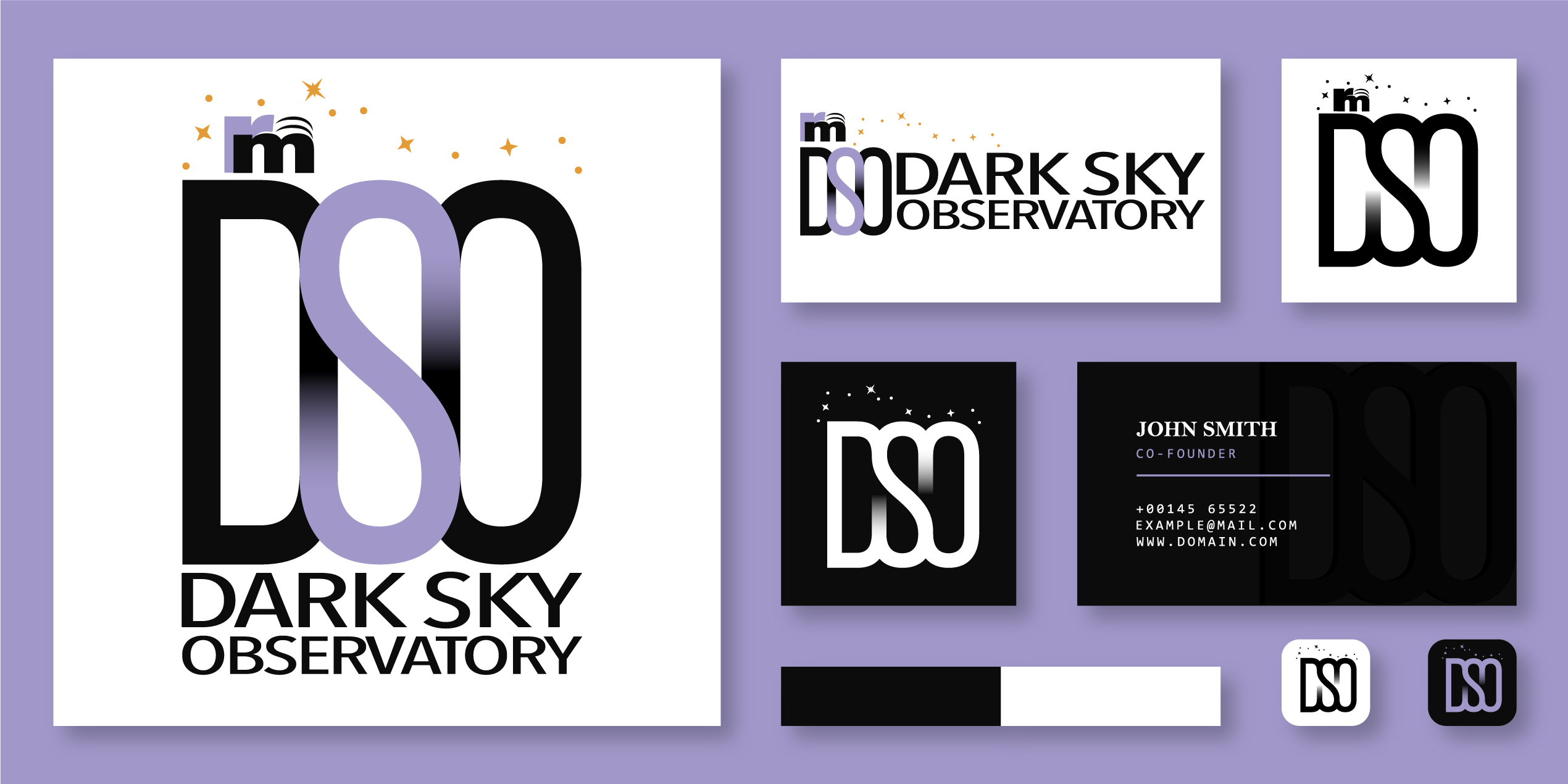
Developing a visual identity for the River Murray Dark Sky Observatory, the client required a brand that fell under the River Murray International Dark Sky Reserve identity, while science and research focused, there was also a element of playfulness and approachability acting as both a hub for science and as a tourist destination.
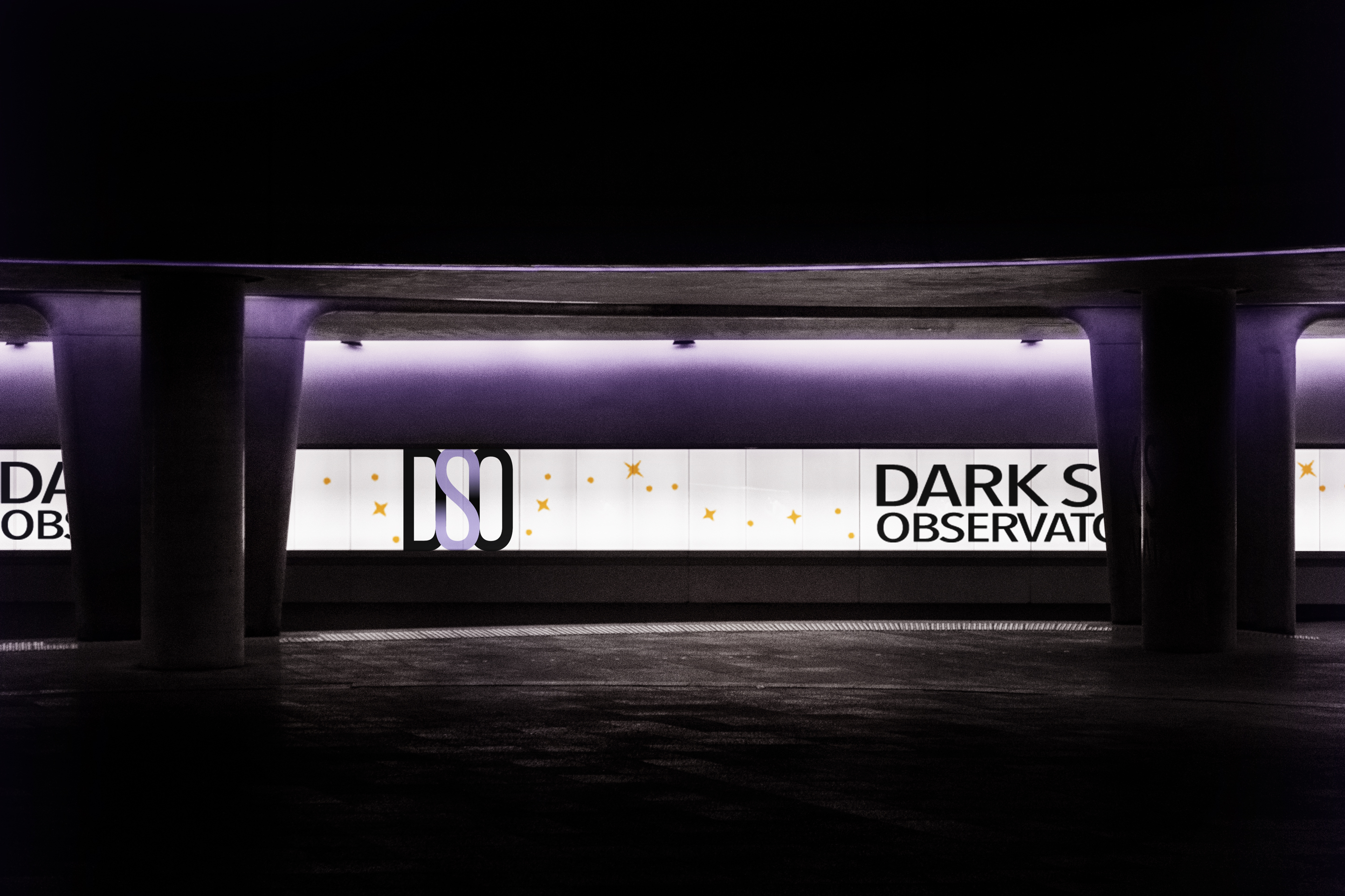
My design approach was to centre around the idea of duality, while science and research is the main focus, the nature and tourism part is also a very important factor. Both aspects are explored with design choices such as using a more neutral, stoic black colour contrasted with a playful pastel purple, alluding to colours of the night sky, being the central focus of the observatory. The use of gradients in the logo bridge the two differnt spheres.
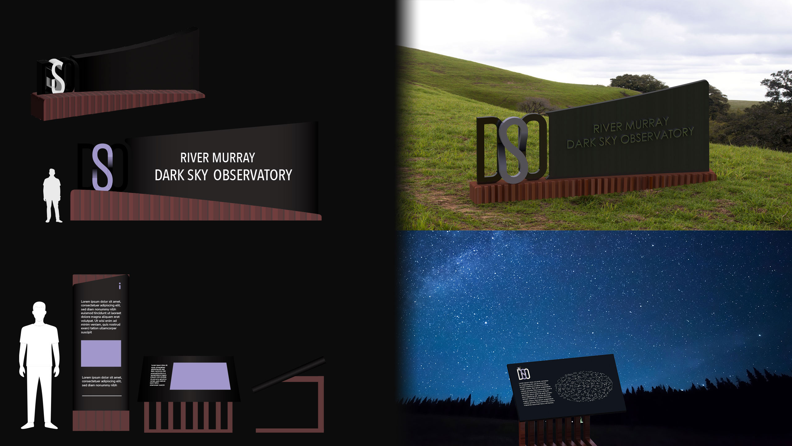
Wayfinding
The signage is an extension of my design goals of creating a visual brand that has a strong sense of duality and balance. The use of wooden base keeps the wayfinding connected to nature and the reserve, and the black main body part, made with black anodised aluminium highlights the modern, scientific aspect of the observatory.